

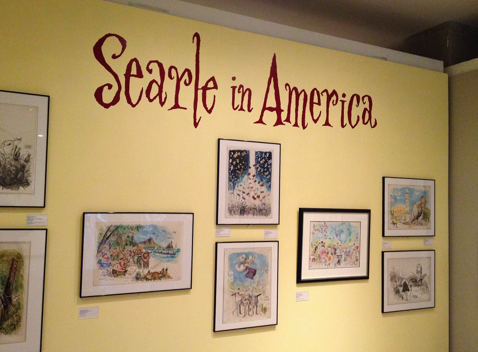
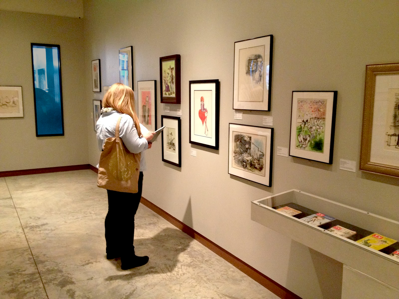
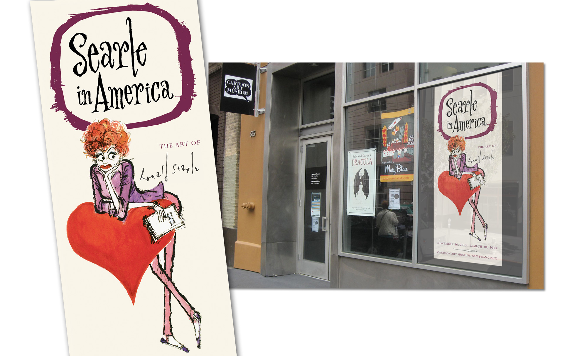
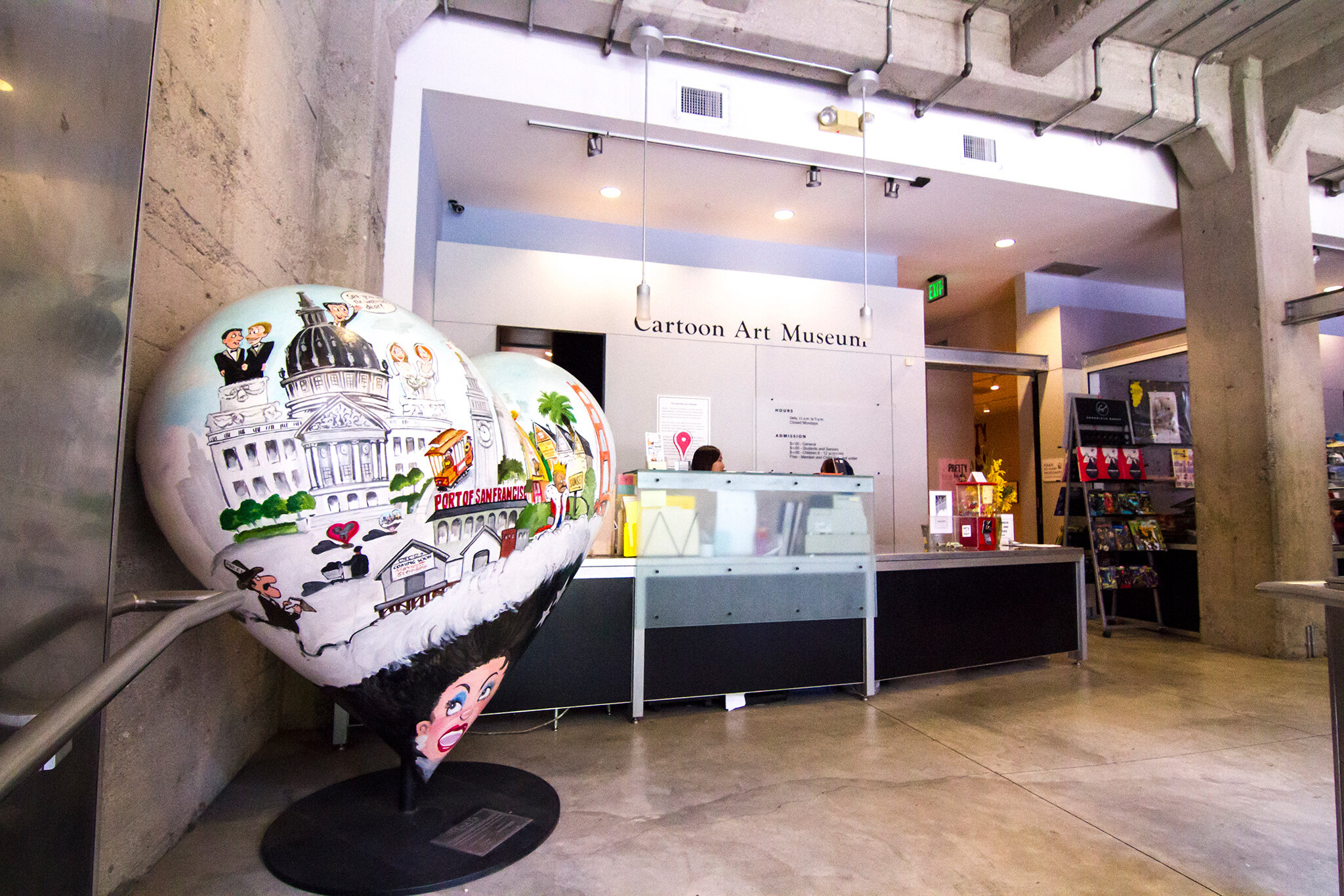
Legendary illustrator & humorist Ronald Searle was honored at the Cartoon Art Museum
with an exhibition of his rare original artwork while on assignment in America during the ‘60s.
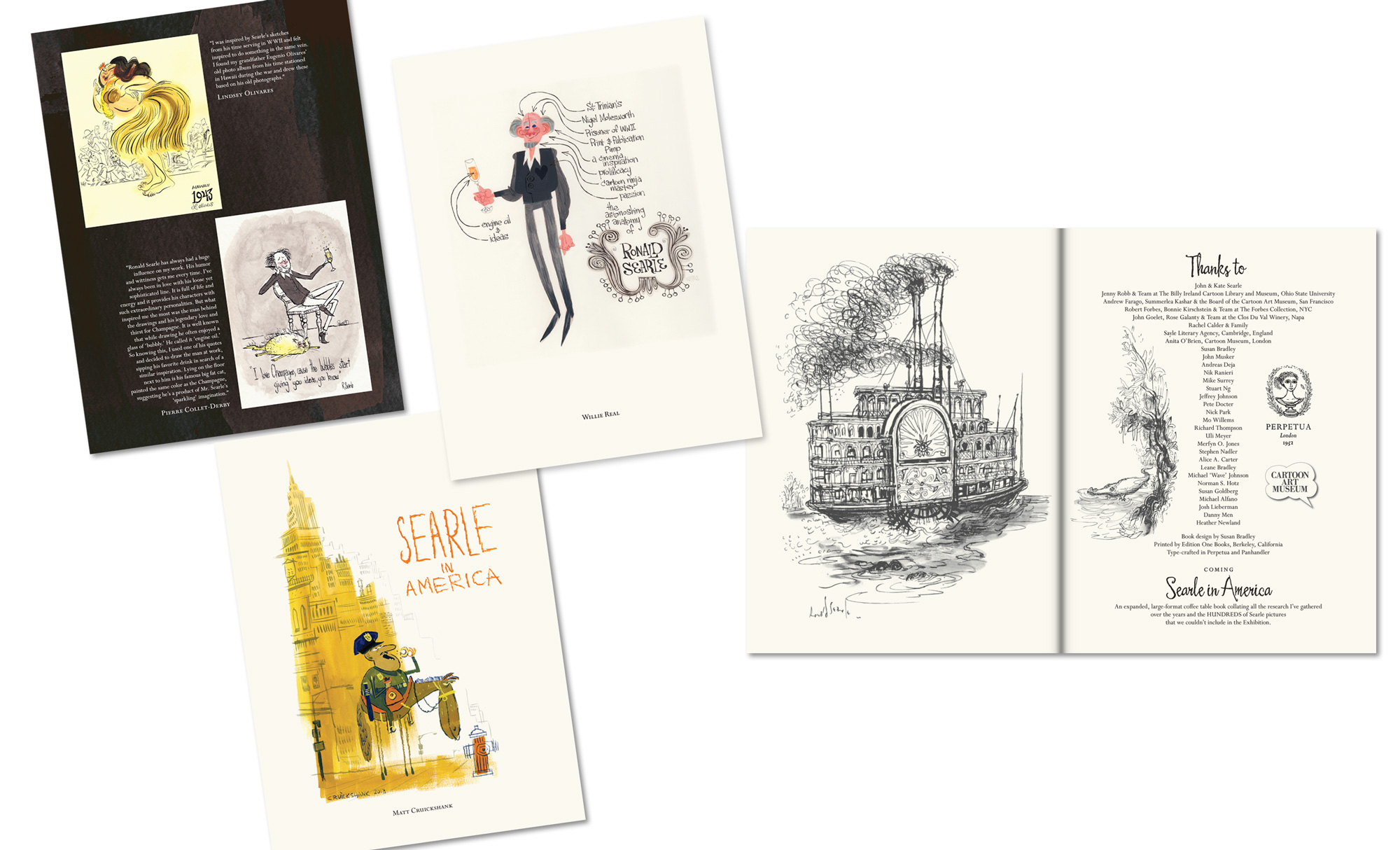
To celebrate, a limited edition 100-page color catalogue was created that also included Searle tribute art from numerous celebrated illustrators all over the world.
Curated by story artist and Searle historian, Matt Jones.
Identity design, marketing and catalogue design & production by Susan Bradley
— my process and notes continued below —
When I started this identity project with Matt Jones, we were both at Pixar.
He was/is a lead story artist and I was also on staff as a graphic designer and Pixar’s title designer. Not only was I thrilled to work with Matt, but I was also grateful to discover more about the famous British Ronald Searle and his historic humorist works & St. Trinian’s art. Searle’s prolific work blossomed internationally when the heyday of magazine illustration was at its peak.
I knew all of this had to be perfect AND thoughtful. Matt had spent numerous years following Searle and met with him more than once, in France, where Searle lived the last decades of his life. Matt Jones was a Searle historian. Lucky me!
Studying Ronald Searle
With the start of most projects, I take a deep dive studying my subject and absorbing a visual inventory: personality, tones, styles, period of time, pertinent characteristics, reception of the work, etc. What a pleasure, studying Searle’s works & illustrations; so many of which were in Matt’s office! And as I am obsessed with typography (became ‘Type Queen’ at Pixar), I wanted to study his amazing pen work carefully. Oh, the lines… Searle’s work with ink on paper was completely exquisite & masterful, yet felt so light, informal and playful. I was completely overwhelmed—his frenetic style had ruthless continuity that flowed lovingly into every angle of his pen. These dichotomies are so fascinating, and I continue to be awestruck by Searle’s timeless humor and his personal history.
Catalogue Logo & Cover
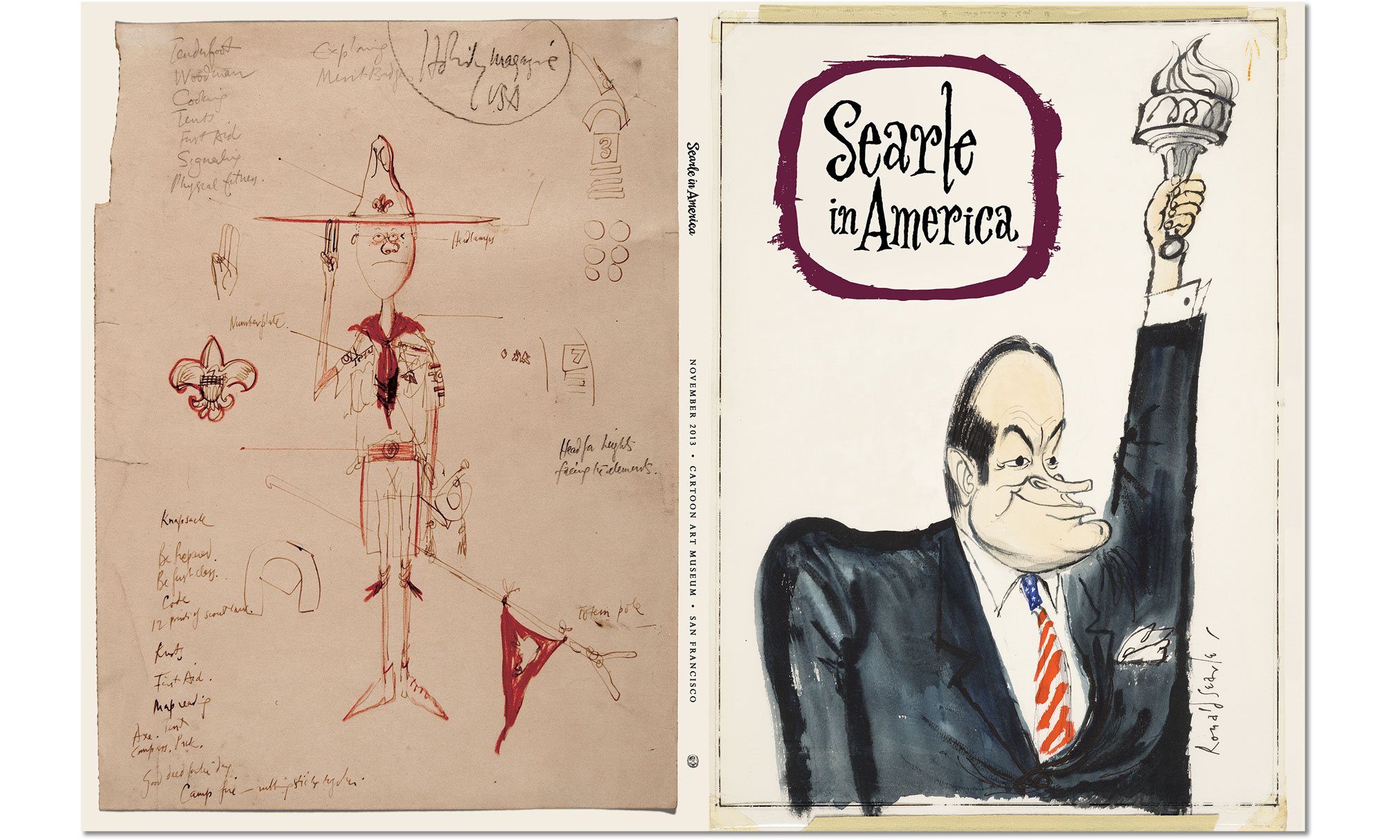
—I began with the logo in few layout formats to accommodate future uses. And I had all of the tools to do so, with a bounty of Harold Adler’s pens and ink. My lettering for the logo began on paper this way and was refined later in Photoshop by painting with my ever-trusty Wacom pen. I tried to capture Searle’s style, saluting his fluid & jaunty penmanship. The inky shape of an old television felt perfect for this American tribute as well.
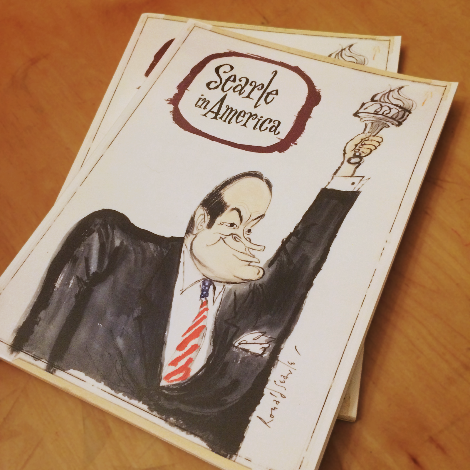
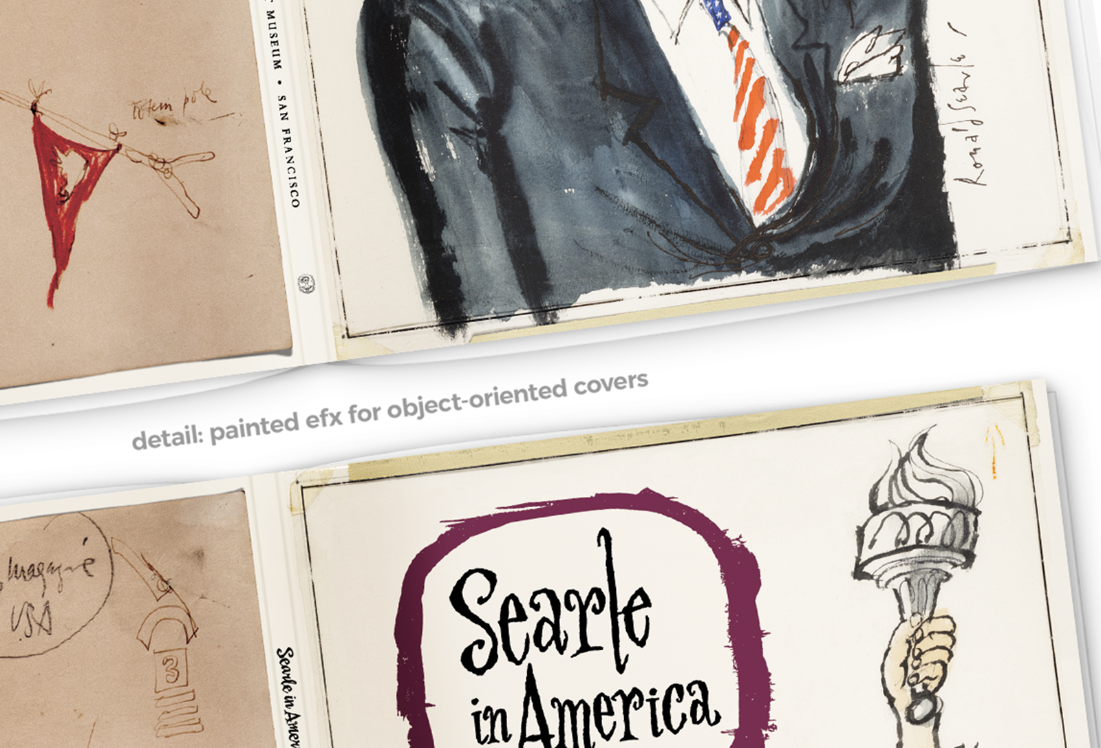
—To represent ‘America’ for the cover, Searle's “Bob Hope” piece finally won out, and I decided to include all of its original paste-up markings & tape—which inspired choices for the entire work.
Configuring a Mountain of Content in Smart Ways
I processed and configured numerous media formats, color spaces and text here.
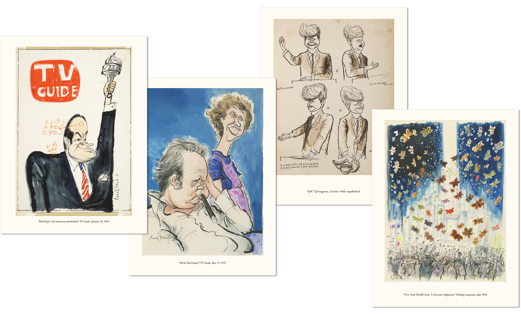
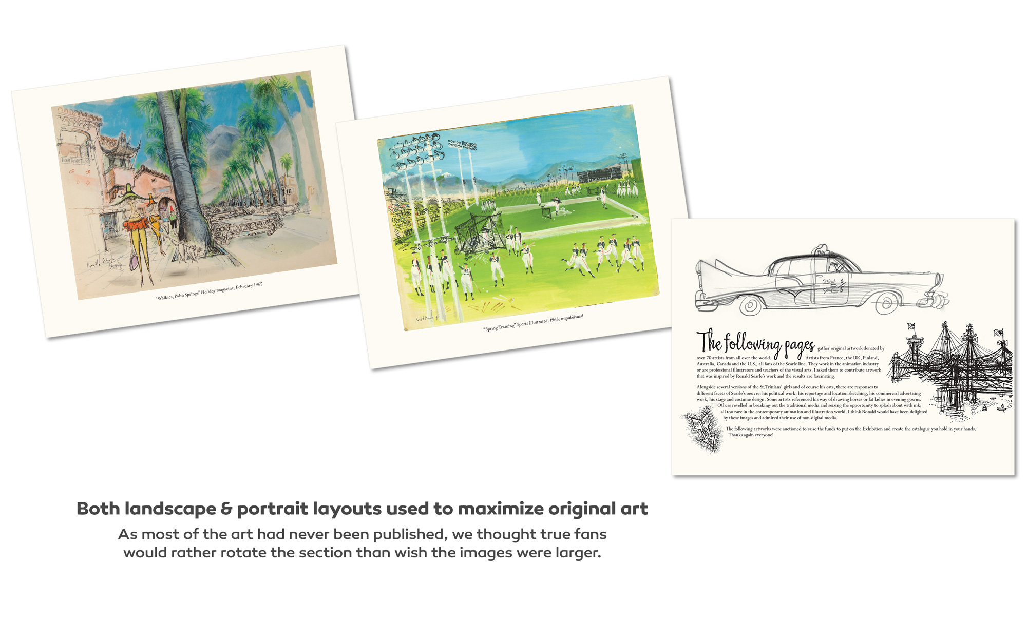
—To maximize the viewing size on only 9x12” pages, the first half of the catalogue is organized by works in portrait, then in landscape. As some of this work had never been published, we thought true fans would rather rotate a section than wish the images were larger.
—The second half of the catalogue is comprised of eighty+ pieces of Searle tribute art from notable illustrators around the world. I asked many artists to add a small story of Searle’s impact on their work as an illustrator—which further personalized the pages into a fitting tribute.
Color correction, Layout & Editing
Every page of art needed master color & exposure correction, as scanned art came with varying color profiles and sources. Color corrected via Spyder color-calibration on a ZDisplay DreamColor monitor.
Layout iterations, final assembly—InDesign. Color correction, compositing fixes, type design—Photoshop.
High–Resolution Compositing Fixes on Searle Art
Many pieces for the Catalogue coming to us digitally needed restoration or fixes if the digital source was compromised or the photographs had keystoning*. I retouched or restored missing edges and fixed reflections, shadows, edging, focus issues and distortions, making sure all composited images were perfectly seamless.
Style Choices & Continuity
Since most of Searle’s American audience knew him through his 1960s—70s published works, like TV Guide covers and magazines, I distinctly chose to leave intact all of the original marks or notes around the original art for a more intimate experience. Leaving the printer’s production marks added a more tactile atmosphere and felt like an authentic representation of how and when his work was originally produced—in print.
Result—GREAT SUCCESS!
We celebrated Searle’s first San Francisco Exhibit with a super fun launch party and a lovely dinner—where Matt Jones, SF Cartoon Art Museum curators and illustrators from the book & elsewhere recounted wonderful stories and learned new things about Searle. They were thrilled with the results. That this was a very rewarding project, is a great understatement. A truly good time was had by all.
*Keystoning is the distortion of an image dimension, such as accidentally capturing or projecting an image on a slight angle.


